Wednesday,
July 27,
2016

CRUNCHY PERVERSION.


AN
INTERVIEW
WITH


DANIEL ALONSO


BY
JOAN PONS


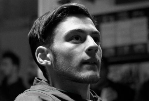
Daniel’s photograph: Celia Macias

Crunchy perversion. An interview with Daniel Alonso – O Production Company

Pony Bravo’s record covers; the posters for their concerts; the artwork of their CD’s interior booklets… I often have the feeling that these images are shared much more (the dictatorship of click statistics) than the band’s songs. All of them are created by Daniel Alonso, one of the members of Pony Bravo. It isn’t very frequent for him to be asked about this more graphic side to the band in interviews, but his visual remixes (“They’re always photomontages, with some graphics; there’s no drawing as such”) have contributed to creating great part of their identity as a band. A look at Daniel’s portrays the band as having a satirical and political discourse: they clash concepts with a very Sevillian sense of pop fun and are firm believers and practitioners of the faith in Creative Commons. And all this we can tell without listening to a single second of their music: it can simply be deduced from their artwork and posters.

Pony Bravo’s aesthetics have personality by the ton. There’s particular poetics, a distinctive tone and a stance. It’s difficult to find another band today (and I don’t mean only at a national level) with such a personal graphic character and back fed by their music (Swans?). Since we’re at it, exaggerating a bit we could say that the emulsion between the audio half and the visual half of their artistic proposal, although at first it might seem as though it has nothing to do with it, is as close as that of Joy Division-New Order, Talking Heads or The Smiths.

Daniel Alonso, ex design and photography student with a great deal of self-taught intuition, devises these photomontages as a creative and playful activity: there’s joy and fun in his artwork… although there’s a lot of spite as well. Something that also happens when he gets out of the photographic cut & paste sphere (installations or , for instance) or when he collaborates with other artists (Mopa Producciones, Niño de Elche, Juan Carlos Lérida or Za!). In any case, Daniel is very conscious of where he gets inspiration from for his collages, in which a lot of the time, 2 + 2 aren’t always 4: 

“Miguel Brieva was an influence from the beginning, specially because of his critical nature and humour. I also remember that, at the time, when we started, I discovered the short-films that made about Seville in the seventies and they had a great influence on me, like on many other close artists. Apart from that, when it comes to photomontages and the plastic side to it all, I’ve always admired and John Heartfield; today I still consider their work incredible, both the images and the use they gave them.”

Crunchy perversion. An interview with Daniel Alonso – O Production Company

Personally, your montages have always reminded me of the Dead Kennedys (who did some for their back covers or booklets), DEVO, La Polla Records… everything very punk or post-punk. Am I too far away from the truth?
Not at all. Dead Kennedys, DEVO, Talking Heads, Siniestro Total, Derribos Arias and other similar bands… Back in those years and in those musical genres, there were always very good covers and very good ideas. Amazing lyrics, too. They’ve always been an influence. There’s also the whole visual world of Andalusian and flamenco kitsch that is so alive here every day and everywhere; and also the generational moment each one of us lives, with its reference films and albums, which mark us too even if we don’t want to. Maybe the post-punk and post-15M eras are similar. Maybe that’s where we are now. 

Up to what point having in mind such a popular tool as Photoshop, now available to anyone, helps you create your photomontages?
I think it helps: you feel more connected. There’s more people doing the same thing, or using the same tools. The world of memes and other files we send and share every day is very cool and very healthy if it’s used properly. It’s like when punk appeared and people didn’t have to be good at playing their instruments to have a band, something like that. Anyone can create something good in a moment, and that’s a very fun part of technology. To me it’s something positive; it all depends on how you do it, really. 

How do you think the graphic side to Pony Bravo helps perceiving the band? And the other way around: how does the band’s music help to appreciate the graphics?
With time, both languages have ended up complementing each other, at least for those of us who like music and images. Even when we make videos lately, everything keeps on getting together. But I can’t tell you up to what point people associate them. I guess they do, that after ten years there’s some association between one thing and the other.

Would those aesthetics be possible in any other band or artist? (I’m thinking about Za! or Betunizer, for instance)
The ideal thing, I believe, with bands and their aesthetics is what happens now, when we see bands doing more interesting things, they do their own covers and actively generate their videos and other formats. That helps enriching the scene. lf on top of that you collaborate with other illustrators, the better. The ideal thing is for each to try and help develop their own way of using the visual side.

In recent years, when I’ve collaborated with other people, what I’ve done is adapting myself to their coordinates. And then what comes out is something mine but different from the Pony Bravo posters, for example what I’ve done with the company Mopa de Juan Luis Matilla, with Fernando Mansilla, with Niño de Elche and with Juan Carlos Lérida. Each project acquires its own line, there are no rules really.

With Za! and Betunizer I’ve collaborated different times making the posters or having gigs with the three bands as ZAPONIZER. But they usually make their own covers and they’re usually very funny; both bands have been developing that visual and videographic side and… it’s really cool!

Would you say that your photomontages always play at associating dissimilar ideas? Are they a sum always giving an unexpected result?
They partly are: associating images and creating relations and stories is a lot based on that. The result is usually unexpected, it jut pops-up; other times they are carefully directed and crafted processes. It’s a mixture of both. Some ideas end up becoming lyrics for a song and others end up being posters. The same collage and photomontage process takes you where it wants. It’s similar to composing music based on improvisations at the rehearsal studio.

Could this be the formula of your photomontages: humour + social and political commentary? That is, satire?
Yes, it’s true that those elements appear quite a lot, but not always. There are projects that look for aesthetics and beauty without too much of a script and others that are centred in concrete ideas to develop them. The second thing is the ideal one, but sometimes the best way of helping in a project that isn’t your own is focusing on what the person is trying to say. It depends on a lot of things: friendship is one of them: there’s rarely ever money in interesting projects, they’re done just because of friendship, to enjoy yourself. So the elements change depending on whom you work with.

Crunchy perversion. An interview with Daniel Alonso – O Production Company

Could this other formula be true as well: stale traditions + pop?
It could be too, yes. Here in Andalucía there’s a lot of that; a lot of kitsch flamenco and old stale covers. It’s so close to us that I guess it’s an influence. It’s our way of digesting our surroundings and enjoying them. At the end you end up liking everybody… or almost!

And this one: familiar references + crunchy perversion?
I’d even call it Crocanti Perversion.

Do you think that popular culture icons are there, precisely, to be manipulated, to play around with them?
It’s one of the best uses one can make of culture. And, besides, culture itself is a remix… and a collaboration, it’s all very Creative Commons, or underground, or countercultural, do it yourself, etc. Here we have many important aspects.

Remix is in day-to-day life, in jokes, in Whatsapp images, in music, in playlists, in magazines, bands, blogs, festivals… We all remix and try to add a certain personal point of view if we can, some original touch. But it’s all a remix and authorship is always shared.

It’s true that it’s a game, as you say, but I also think that it’s an important and useful game. It doesn’t need to be high culture for it to work.

Seen superficially, it seems as though in your photomontages you only sum two parts of different images, but maybe some works are more complex and are a sophisticated mix of more images.
It’s true that some posters are the result of just uniting two simple images, it happens. But you always have to work a lot in order to find what you’re really looking for. The trick is for the images to appear as though they’re integrated, but there’s a lot of work behind: colour integration, textures, illumination, recreation of parts which aren’t there… and there are also lots of discarded sketches. Lots of them! With humour, for instance, you can do different versions and sometimes it’s a mystery which ones do work and which ones don’t. The ideal thing is working hard and for the process to give you results along the way. It can’t be controlled. Or, well, it shouldn’t be!

Many of your works use, mmm, “sensitive” elements: politicians’ faces, religious icons… Have they given you many problems?
I try not to cross the offensive border and always treat the characters I use with justice and equality. It sounds like I’m joking, but I really do try, and I think that’s why, because I don’t overdo graphic violence and bad vibes, I haven’t had many problems with censorship. I at least try to avoid controversy and calling for attention for the sake of it. I could make wilder posters, but I’m not really interested in graphic violence. I see it in some humour magazines and I don’t think it’s the ideal way to go. Laughing at corrupt people with such violence doesn’t generate change, but a worse feedback. Or it might be just that I’m not famous enough. That’s also true. If you’re not too famous, or if you don’t start spending money like a madman, they leave you alone: you’re just another hippie with a computer. Sometimes people have refused to hang a poster, or they have tried to censor me, but never too big a deal. In any case, with the current “gag law”, anything can be censored, so we’re all on the same boat.

Do you think your posters have helped Pony Bravo to be perceived as a band with a political dimension?
I’m not sure whether having a political dimension today is good or bad… It sounds weird. I guess they have. In fact, we’ve been defending Creative Commons for about ten years, fighting the SGAE, publishing our own records without ever perceiving our copyright money, organising stuff, saying no to offers from big labels, publicity deals, trashy TV… It’s all very 15M and without a coin, etc. So I guess that yes, we are living these times and this approach. At first no one wants to get involved, and you’re cooler if you talk about these topics in a subtle way, softly, metaphorically, without going in too deep. But it’s the times you end up having to live. I think it’s a lot more seedy and vulgar not to fight, not talking about anything but you. So it’s also a question of style.

By the way, Political Dimension sounds like a super cool name for a band! It would be very funny to call a band that. I’d go see them, for sure!

Crunchy perversion. An interview with Daniel Alonso – O Production Company

And have you ever had copyright problems with the authors of the images you use?
The same ones that remix visual artists, hip-hop musicians creating bases or DJs have, that kind of thing. The threat is always there, it’s a constant danger. At the end you get used to it and defend the art of the remix as a powerful and necessary genre. But it’s true that the system is so badly organised and it’s so corrupt, with all the copyright and other rights and stuff, that it’s a pain in the ass. It’s very difficult to explain how it could be done better. It seems difficult when it’s quite simple. But at least we’re advancing a little with things such as Creative Commons, and we have to go on that way because there’s no other solution.

You know that some people consider your photomontages easy jokes, or even vulgar. Why do you think some people might perceive them as such?
I might have done some easy, and even seedy, jokes. It’s a collateral damage when you work with visual humour, or retarded humour: doing something beautiful is easier, humour is much more complicated. There are many branches and sub-types within humour, and some of them can be perceived as that, as vulgar or easy. And sometimes they are, by mistake or because they have to be like that. But in general they’re a kind of artistic work as serious as any other, done using a lot of effort and dedication.

The fact that their goal might be producing an idiotic and easy laugh at a given point doesn’t undermine their importance. In fact, it’s very important to laugh like an idiot, several times a day if possible. I’d say even more: I think each meme a friend sends me via Whatsapp is a work of art; it makes me happy, it makes me laugh. They’re remixes, many of them high quality ones, very intelligent, and very idiotic too, all united in a wonderful way. It depends on what you like, I guess. To me, high culture is almost always quite tacky.

Up to what point can we guess that the person creating those posters comes from Seville?
The first years it was something intentional. I spent a lot of time working on Sevillian images: the Giralda, the virgins… It was also the time when we started singing in Spanish, with our accent, no matter how it sounded; trying to do Andalusian rock because we wanted to do music we liked and we had close by, and most of all to have fun. Today there’s a wider range of options, and each idea asks for its own image. I’m no longer working that world; I guess it’s not necessary anymore. In fact, it’s quite healthy sticking posters on the wall, close to your home, with interpretations of your own city. It’s fun; you do it with care in the end. Each one should illustrate his area, I guess. It’s also about giving visibility to a different Seville, not the touristic and mediocre one we see on the telly a lot of the time. Those alternative cities are always interesting, I think. The exact place is in the end the least important thing.

Have any of your photomontages not been seen too much and you would have liked for them to have more visibility?
Lately, when that happens, I post them on Tumblr and there they are. Sometimes you don’t produce some of them, or an image is discarded, or the print-run is so short that there aren’t many. Anything has happened. During the last exhibition, I rescued some of the ones I had at home and created a remix table.

Crunchy perversion. An interview with Daniel Alonso – O Production Company